In this article, you will learn nine UX and UI trends for 2021 that you need to consider. We’ll look at several illustrative examples of websites that reflect future trends of 2021.
1. Brilliant Animation
We all know that complex animation affects how fast a website will load. The more complex the animation, the slower the site loads. But any interactive animation can be effectively optimized without any problems for the website.
Movement can speak louder than words. Using new technologies, you can add amazing animation to your website. For many companies, this is an unknown area, but it’s cool to finally be able to make high-quality animations without losing the loading speed. It’s high time to give it a shot and not be afraid. Otherwise, your competitors will do it first.
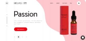
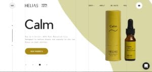
Let’s have a look at the UX and UI of a site with amazing animation:
2. Empty Space
Not only is empty space aesthetically pleasing to the users’ eyes, but it also greatly influences the effectiveness of the website because it enhances the readability and perception of the information.
When elements have to fight for attention, they become invisible to the viewer. When one element is highlighted in some way, it gets all the attention. It is crucial to give the site some space to effectively convey the message to the user.
Using empty space when designing a website is quite pragmatic because people tend to percept shortened information for a longer period, and it becomes less understandable. Surrounding an idea with empty space is a great way to highlight it. Just be sure that the concept is worth highlighting.
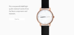
Here is a website with a lot of empty space:
3. Visual Coding Tools
Sometimes, designers create designs that can’t be implemented within a specific timeframe, or the budget is not big enough. We are also in an era when designers can easily learn to code and, thus, become dangerous. Why? They know enough to argue with developers but not enough to create a website themselves.
In 2021, new tools will make coding easier for designers. In fact, there will be visual tools that will allow designers to create anything they want using HTML and CSS. They will provide designers with the ideal opportunity to start coding.
We’re all moving toward interactive designs, so it is becoming increasingly difficult to explain the way the aforementioned interaction has to operate and look. The relevance and necessity of a visual instrument cannot be overstated.
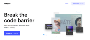
Becoming a dangerous designer is a must. It’s crucial to mix design with the coding.
4. Mixed Experience
Visualizations speak louder than words. Embedding fast-loading, unsupervised videos into a site can help the design look more lively.
Content is the driving force. It influences users greatly and powerfully. Mixing content types provide users with a beneficial and unique experience. The main trend for websites to include various screens, illustrations, and videos. A good website should include a little of everything in its design.
A good example is a website called Feed. It has a very unusual concept that takes a user into the world of music, creating an immersive experience. This experience wouldn’t be possible if not for the blend of animation, sound, videos, and text.
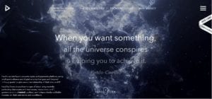
Create experiences, not build kits.
5. Asymmetrical Design
Classic website design is symmetrical. It allows you to easily view and follow the flow of information and determine the boundaries of the site. Symmetry conveys a sense of completeness and simply helps users better understand the site’s structure.
In 2021, the trend will be the opposite. Asymmetrical design will become popular. Now is the time when asymmetry will return to sites.
The absence of symmetry helps users separate the navigation menu or sidebar from the rest of the content in a more natural way, leaving more space for useful information. Asymmetry is suitable for emotional design and the use of advertising images that create a positive mood and reinforce emotions. In general, asymmetrical balance helps create a sense of dynamism.
The Japanese GQ website is a good example of asymmetrical design:
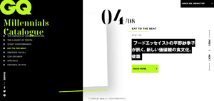
What was once a utilitarian approach will become a visually appealing way to present any type of information.
6. Unusual Illustrations
By 2021, we will have everything illustrated to the point that we will have to invent a new style of illustration. Illustrations are nothing more than art on digital media. This medium opens a window of opportunity for artists who hate stock illustrations. Moreover, the more strange and out of the ordinary the illustrations are, the better. That way, the site will be different and stand out from the crowd, attracting attention and encouraging users to interact with the website. Of course, in this case, both designers and illustrators are necessary, but it’s worth it.
Here is some unusual illustration in action:
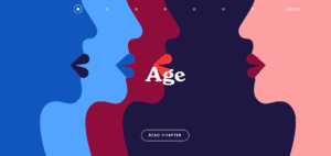
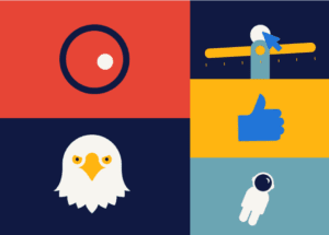
This absurd design is a good example of using a purely artistic approach to creating content. Here is an example of an interactive, illustrated menu.
7. Soft Gradients
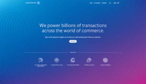
One of the key emerging trends is the use of gradients. It exists now, but in 2021, this trend will not lose its relevance because it’s a very simple technique that adds liveliness to web design.
This year, you will see more sites with soft gradients. Why? Sharp changes in color negatively affect the perception of information. At the same time, monochrome is considered boring. Gradients are very unobtrusive, but they add uniqueness and aesthetics to the product. They are a guaranteed trend for the next five years. Check out this example.
8. Muted Colors
Design critics and reviewers believe that muted color palettes will rule this year. They claim that it will be a response to the prevalence of neon and bright colors in recent years. Brands began to actively differentiate themselves by using the principle that “brighter means more noticeable.” Now, everyone is tired of the colorful flow, and the trend toward calmer colors has begun.
The world of design will not be less colorful this year. The colors will just become a little more restrained and deeper.
Muted colors are achieved by lightening or darkening the main colors:
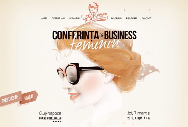
When working with a white background, it’s important to use lighter muted colors, and when working with a black background, it’s important to use darker muted colors. This rule ensures good compatibility and minimizes contrast.
9. Full-Screen Visual Effects
The center of the screen is the place our eyes naturally focus on. However, there are advantages to using the entire page. Showing that the screen is only a part of the visible content creates an immersive experience. This encourages users to read more and reduces the failure rate.
This trend is more suitable for complex issues and socially significant problems, where it is important to show a person the right context. For instance, this is a website about climate change and resilience work for one of the world’s largest NGOs.

Final Thoughts
If you blindly follow trends, you neglect many things for the sake of a few likes and reposts. Trends are cool, but it’s better to have your own style. There’s nothing wrong with wanting to make more money, but sites are remembered for being different. There is no recipe for success, but knowing the trends can help you find it.